on
Data visualization; ggplot I
Throughout 2020, while working on visualizations, I collected useful tricks and ideas to make good looking ggplot charts. Unitl today, this library of useful sources was living at my WhatsApp’s notes but I thought it would be easier to have it all in a single repository. So here I am organizing a year of links that I have been copying into my notes.
Content:
- Density plots
- Style the legend’s colour bar
- Reordering & facetting
- Cowplot & title styling
- Waffle charts
- Fonts
Density plots
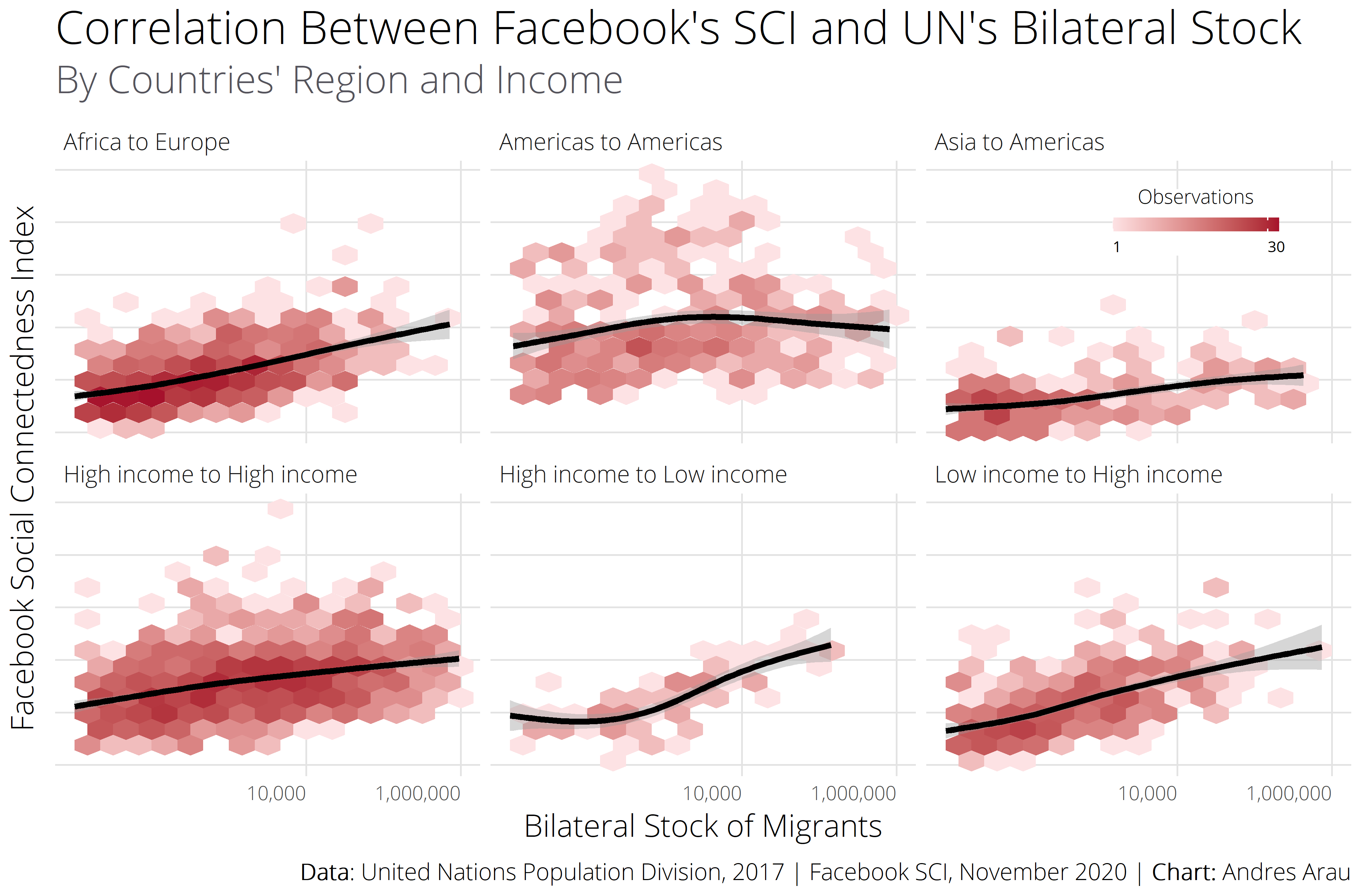
I tend to use scatter plots when looking to the relationship between two numeric variables. But visualizations can become overwhelming when the amount of dots is large. Density plots can help to avoid overlapping by dividing the plot in multiple small fragments that represent the number of points in each area. The example below shows a density plot created for showing the relationship of migrant stocks between countries and their Facebook’s Social Contentedness Index.
In the example below, I used the guides () function to style the colour bar of the legend. This is a worth checking function!
Useful URL in the R Graph Gallery: 2d density plot with ggplot2
Reordering & facetting
The problem is very simple: how to sort bars within each category in a plot? This sounds simple, but one day I spent hours trying to figure this out. The trick is done by using reorder_within() from the {tidytext} 📦. In the example below, I created a “reordered factor” called Team_rival: reorder_within(Team_rival, goles_barca, decada)).
Useful URL: Julia Silge

Cowplot & title styling
It may sound silly but one the most important elements of a plot are its labels. Having the ability to control the color, position, and style of the title and subtitle makes a big difference. There are two 📦s that are useful for this: {cowplot} and {ggtext}. In the example below, I combined these 📦s to colour some characters of the title and to position the text in exact place where I wanted it to be.
Waffle charts
Once in a project, the client asked me to switch tables into more appealing visualizations. I really did not want to use pie charts because they don’t work well with more than 3 categories, and he had already used many bar charts. So, a good alternative was using 🧇 (waffle) charts!
In this example I’m scrapping the unemployment rates by race reported by the Bureau of Labor Statistics
Useful URL in Git Hub: hrbrmstr/waffle
For scraping tables from websites: Storybench

Fonts
There are 5 steps to load the fonts: 1) 📦 install.packages("extrafont"), 2) import fonts from your system into the {extrafont} database font_import(), 3) register those fonts with R loadfonts() (this must be run once in each R session where you want to use the fonts), 4) check that your font is available using fonts(), and 5) use the font family in ggplot theme(text= element_text(family="Roboto")) or in any other specific text of your chart.
Useful URL in Stack Overflow: Changing forns in ggplot2
Example:
library(extrafont)

#See all fonts available
  windowsFonts()

#Check the fonts that exist in the environment
  fonts()

#Import new fonts. For example, in case you download from google fonts set the
#path to your fonts' directory

font_import(paths = "C:/Users/andre/AppData/Local/Microsoft/Windows/Fonts")

# And then load fonts
loadfonts(device = "win")