on
2020: a recap
Although uncommon, 2020 was still a very intense year in which I kept learning and contributing to enhancing the use of data innovations to inform and improve the implementation of development programmes and initiatives around the globe.
This post intends to summarize my work in 2020: countries, organizations, and projects I worked for, my experience working remotely, blog posts that I wrote, and the top 3 lessons I learned.
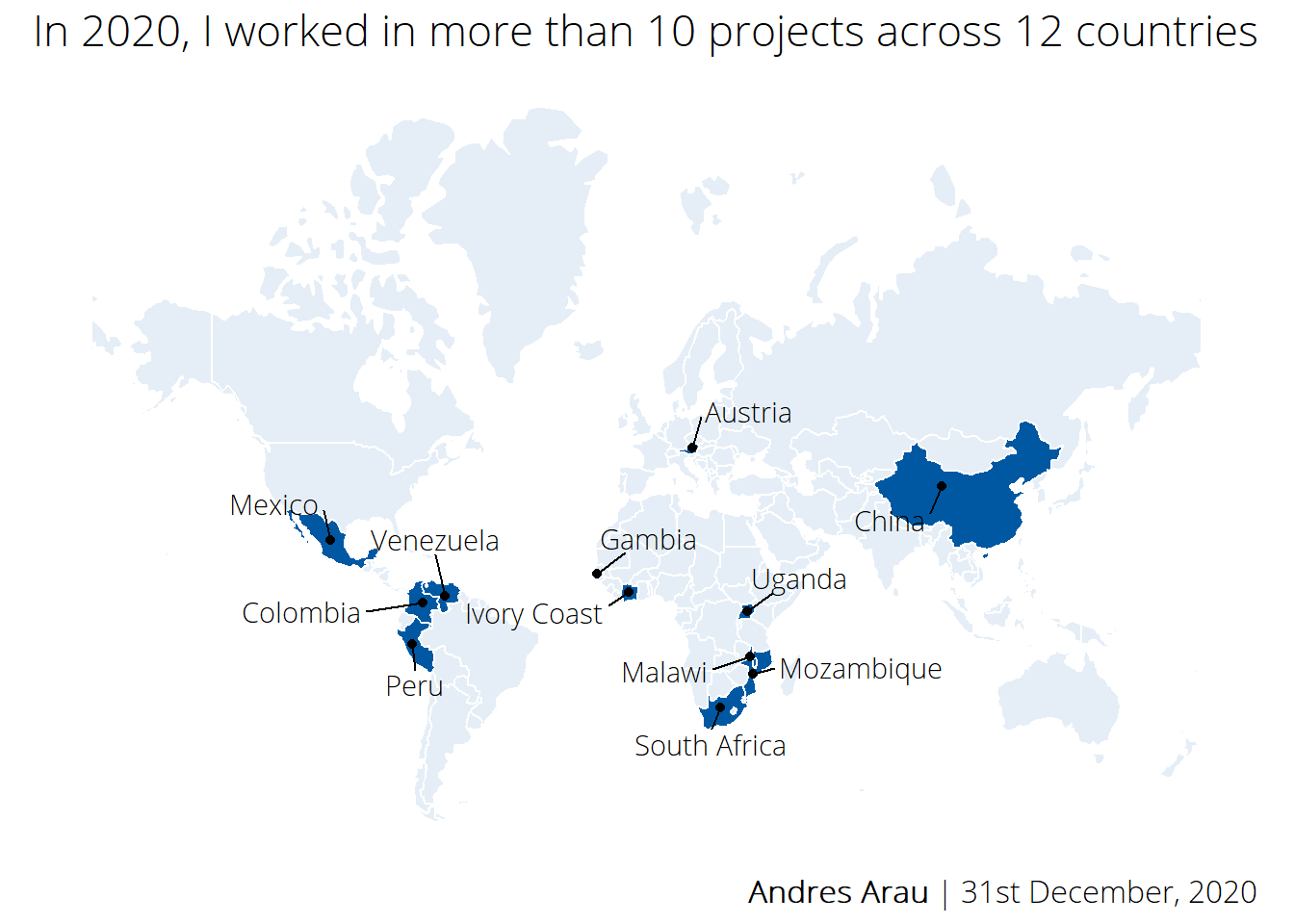
Countries where I worked:
Because of COVID-19, most in-country missions were canceled. We all needed to adapt and get used to working remotely via MS Teams, Skype or Zoom.
Organizations and programmes which I collaborated with:


The route followed while working remotely:
At the beginning of the year, Marti and I decided to work remotely in low densely populated areas where social distancing could be guaranteed and maximized. This was an attempt to make the so-called ‘nomad’ lifestyle work. Thus far, we have driven 4,780km 🚗.
We are writing a blog about this experience.
Projects I worked for:
|
Analysis of IOM Data on Socio-Economic Integration of Venezuelan Migrants and Regugees
|
|
Dashboard to Track Daily Reported Cases of COVID19 in Mexico |
|
Evaluation of UK Partnering for Accelerated Climate Transitions (PACT) |
|
Female Economic Empowerment in Mozambique (MUVA) |
|
Interactive Map to Track the Location of ‘Health Agents’ Trained on COVID19 Prevention |
|
IOM-X Waka Well Campaign To Raise Awareness Towards Safe Migration |
|
Mapping Tool for Assessing Risk Factors for Severe COVID-19 |
|
Rural Sanitation Operational Research (CLTS) |
|
Social and Economic Impact Assessment of Mutation Breading Projects Under the RCA |
|
Strengthening Local Development in the Highlands and Rainforest Areas Project (PSSA) |
|
Uganda’s Education Response Plan (ERP) |
|
Urban Poverty Study in Maputo and Beira |
Blog posts I wrote:
When the lockdown in Spain was at its peak, I decided to start my own blog. The idea behind it was to have a repository of ideas which I come up while working on different projects. This is sort of a binnacle that allows me to document what I do. I go back to some of these posts very often to remind me how to approach certain coding issues.
These are the posts that I wrote this year:
Set up a website with R using blogdown, GitHub, and DigitalOcean
Data Science On The Road. This is a blog that I am writing with Marti about our experience working remotely. Our idea is to visit all the Spanish provinces by the end of 2021.
Top 3 lessons learned
1. Information Management Systems for MEL purposes must be simple but effective. I built a Result Management System for UK PACT which is a programme that operates in 6 different countries and involves tens different stakeholders with different needs and responsibilities. Thus, the implementation of an effective MEL system represents a real challenge. After having designed and deployed a data system that allows different projects to report against the same indicators -logframe- globally, we have learned a lot about approaches to improve the way data is collected, analyzed, and disseminated -trough online dashboards- for different audiences. The main lesson learned is that “the simpler the better”. This is, of course, not easy to implement but it is important to keep in mind when building a data system that will be used and consumed by different audiences for different proposes.
2. Working with multidisciplinary teams increase the scope and power of the message. Everybody is talking about Data Science , Data Innovations, Big Data, Dashboards, Data Visualization as the thing. However, we must never forget that data should be at the service of those who are experts in thematic areas (health, education, climate change, migration, etc.) and those who know the context where data is to be used to inform or to provide evidence. An expert in fancy data methods will struggle quite a lot to deliver a powerful message without the voice and experience of other areas. Including multidisciplinary teams is key when deciding the most basic things like which colors are to be used for a visualization, which element a dashboard should contain, which are the indicators that best inform a certain audience, or which tone should be used in a report. I have the luck to join the Mozambican Scientific Advisory Group on COVID-19 which was an example of the power of working with colleagues from different backgrounds and expertises.
3. In Data Science, the more you know, the more you realize how little you actually do! The trend is very clear, innovations are moving faster than we are capable to digest them. There is not a single project for which I do not have to learn a new thing (from how to create a visual to effective manners to analyse big ammounts of data), and for every new thing there are hundreds of different possibilities. I try to constantly read blogs, books, or tweets about efficient programming, data visualizations, and dynamic documents but it is never enough! The more I dive into this world, the more I realize how little I know about it. However, this makes me very happy because it awakes my curiosity on how to continue implementing new approaches that can help the implementation of large development initiatives.